
Advertising Design Creative Learnings
The following creative learning points are taken from Primedia Outdoor’s study into the effectiveness of outdoor advertising media :
- Use strong, striking colours to create impact
- It is preferable to have a coloured background rather than a white background
- Simple design (i.e. uncluttered) but not boring
- People bring the ad alive. They make the brand more relevant
- Product demonstration is particularly important to less sophisticated, rural consumers
- Higher LSM, urban consumers want innovation and creativity (particularly relevant to younger audiences) Outdoor advertising design can be used to reinforce the positioning of the brand through the use of creative elements.
Outdoor Advertising Design Guidelines
The outdoor advertising viewing audience is mostly mobile. People travel swiftly in vehicles or walk at a brisk pace while they perform the activities of daily life. Mobility limits the potential viewing time of an outdoor advertising message to only a few seconds.
Because of limited exposure time, outdoor advertising design requires a disciplined and succinct creative approach. However, high frequency is a fundamental strength of the medium and repeated exposure will ensure that a message is absorbed and retained over time.
Here you will find guidelines and basic rules for designing for outdoor advertising mediums. If you require any assistance with visualising or designing your outdoor advertising creative.
Outdoor Advertising Design Considerations
-

Product Identification
Is the product clearly visible?
-
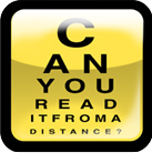
Short Words & Short Copy
Can the reader read the copy at a distance? & Is the basic idea expressed quickly and with impact?
-

Legible Type
Is the copy legible whilst moving?
-

Large Illustrations
Do the illustrations demonstrate the products usage? Are the illustrations visible from a distance?
-

Bold Colours
Do the colours have impact and complement each other? Use colours with contrast. Try to avoid subtle colour blends which belong in print.
-

Simplicity
“Keep it simple” – does the background interfere with the basic idea?
-

Intrigue
Is the consumer involved? Will it attract attention – does it have an IDEA?
Outdoor Advertising Design Legibility Guidelines
Colour
The spectrum of full colour, vividly and faithfully reproduced, is one of outdoor advertising’s distinct advantages. Designs bursting with brilliant colour can evoke emotional responses that will inspire lasting impressions.
Complementary colours such as red and green are not readily legible. Any combination of colours of similar value, even without vibrating, will have low visibility in outdoor design. However, complementary colours that have strong contrast in value, and therefore little vibration, provide maximum visibility.

The colour combinations below demonstrate readability at distance with No.1 being the most legible, decreasing in legibility to No.6

Typestyle for Outdoor Design
Fonts selected for outdoor advertising designs must be easy to read from variable distances. Adequate spacing between letters, words and lines will enhance visibility. The relative size of letter characters is also an important consideration.
Upper and lower case type is easier to read than all capitals letters

Too little spacing between letters makes them merge together

At long distance, very heavy letters become blobs, and very thin letters become invisible

Ornate script faces, and extensive contrast between thick and thin reduce legibility
Tactical Advertising Design
The world is a hectic and busy place. Outdoor advertising reaches people whenever and wherever they travel outside of their homes. Over time, outdoor advertising can consistently reinforce a message with crisp immediacy.
Location
Outdoor advertising conveys the right message, to the right audience, at the right time, in the right place. Understanding the dynamics of the marketplace is essential for effective outdoor advertising design. Often, finding the relevant and hidden relationships between the message and the environment makes the advertising smart.
Although many outdoor panels have a landscape format, some displays are portrait. The physical orientation of an outdoor advertising unit will significantly affect the placement of design elements such as product identity and the headline. Orientation will also affect the overall balance of an advertising design. It is important to remember that geography, demography and the orientation of a display are all necessary considerations when designing for the outdoor advertising medium.
Recency
Outdoor advertising is a frequency medium that provides multiple exposures to a message throughout the full duration a campaign period. Recency is another important factor. Defined in the book, “When Ads Work” by John Philip Jones, recency reminds people who are already in the marketplace that a brand, store or service is a good choice. Consistent and repeated exposure to an outdoor advertising message over an extended period of time will maintain high levels of advertising awareness and recall. To avoid memory decline, multiple design executions for a campaign can be implemented simultaneously or introduced at appropriate intervals during the campaign period. Source: Outdoor Advertising Association of America
Outdoor Advertising Design Golden Rule: Less is More
Let’s examine this statement further…
1 message, 41.1% awareness.
2 messages, 36.7% Awareness, a 5% decrease in awareness.
3 messages, 34.9% Awareness, a further 2% decrease.
4 messages, 33.8% Awareness, another 1% drop in awareness levels.
5 messages, 29.2% Awareness. A total decrease in awareness of 12% overall!
Simplicity
Your advertisement is on the street, therefore KEEP IT SIMPLE
- In most cases, bus shelter ads are viewed for just two seconds. In that time, the brain has the ability to take in just five of seven words.
- The message must be easy to absorb at a single glance.
- The identity of the advertiser should be immediately clear.
“The poster is finished when you can’t find a single element to remove”
-R. Fleege, Advertising Art Director and Copywriter, Robert Fleege & Partners
Be Legible
- Use type large enough to be read from a predetermined distance.
- Match your typeface to your Outdoor Campaign.
- Overly fat or thin type or that which is super imposed over a complicated background should be avoided.
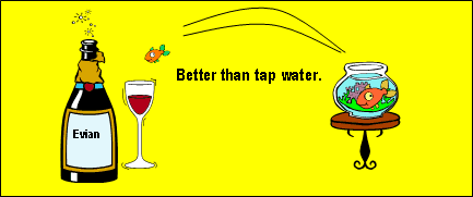
Clear Product Image
- An image attracts the eye and quickly conveys an impression.
- Simple images are easily read.
- Outdoor advertising is found within the consumer environment; a clear image of the product enables product recognition and therefore, product identification in store.
Brand Must Stand Out
YOU WANT TO BE REMEMBERED!
- Make sure that the relationship between the design and the brand is self evident.
- Keep a consistency across all your advertising campaigns.
- Use a font that is easily identifiable with your own individual advertising.
- Enable quick brand recognition through previous awareness of your campaigns.
Celebrities Attract Attention
Using celebrities can increase consumers’ awareness of the ad, capture their attention and make ads more memorable.
3 reasons to consider celebrity endorsement:
- celebrity values transfer to brands
- celebrities establish credibility around brands
- celebrity involvement brings added interest to the campaigns
Involve the Audience
- Do more than just advertise. CREATE DIALOGUE NOT MONOLOGUE.
- Involve the audience so they talk and debate your campaign.
- Challenge the audience; use intrigue, use humor, be different, be bold.
- The better the consumer involvement, the less media weight a campaign may need.
Location
- Understand your marketplace, understand your audience.
- Post your campaign where your audience will be.